

Is There a Gender Bias in QReports Ratings?
Looking at the relationship between lecturer ratings and gender.
Introduction
When deciding what classes to take, Harvard students place a lot of value on QReports scores. Whether it’s finding the “gems” or finding the best professor for a certain class, Harvard students look to QReports for guidance. However, how do we know that students’ implicit gender biases aren’t reflected in the scores, rather than the merits of the instructors and classes? Our team investigated whether there were patterns in QReports lecturer ratings that suggested implicit gender bias was impacting scores.
Data
We explored this question by examining data from Harvard QReports ratings from the Spring 2022 semester. These ratings span all available QReports scores from all Harvard College departments. Using an algorithm, we assigned a female or male classification to each lecturer based on their names. This comes with limitations, as this is not 100% accurate and it does not take into account what gender lecturers identify as. However, this approach was the most efficient way to make a general estimate of how the lecturer rating distributions appear in actuality.
QReports Distribution
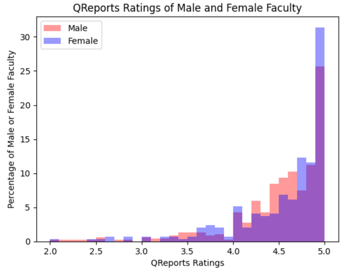 Figure 1: Bar graph depicting QReports lecturer rating frequency by gender
Before investigating differences within departments, we sought to investigate whether there existed a general discrepancy between female and male QReports lecturer ratings. Our research found that although there exist similar ranges among QReports scores for male and female lecturers, there is a visible pattern in which a greater proportion of female lecturers tend to be assigned more extreme scores. There is a clear difference in frequency between male and female lecturer ratings from about ratings 4.3-4.7, with a greater proportion of male lecturers receiving these scores. However, there is a greater frequency of female lecturers receiving scores in the highest range of ratings. On the other hand, female lecturers also have a visible greater frequency of lower scores within the range of 3.7 to 4.2 compared to male lecturers.
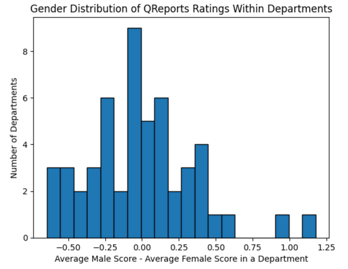 Figure 2: Bar graph depicting the frequencies of the differences between average lecturer scores per department
The distribution of the difference of the average male lecturer score and the average female score in each department appears to be roughly normal. This result is encouraging, as most departments do not contain great differences between male and female lecturer ratings. It is important to note two outliers in which the difference between the average male and female scores of these departments are much greater than a majority of departments. These two departments are Applied Physics and Philosophy departments, with average differences of about 0.91 and 1.78, respectively. However, this data is skewed by the fact that there is only one female lecturer included in the ratings for each of the Applied Physics and the Philosophy departments.
Overall, our team found that the top male-friendly departments with the greatest differences included: Philosophy, Applied Physics, Government, History of Art and Architecture, and Folklore and Mythology. The top female-friendly departments include: Engineering Sciences, African and African American Studies, Global Health and Health Policy, History, and Sociology. The departments with the greatest similarities between average male and female lecturer scores include: Chemical and Physical Biology, Biophysics, East Asian Languages and Civics, Biostatistics, and Art, Film, and Visual Studies.
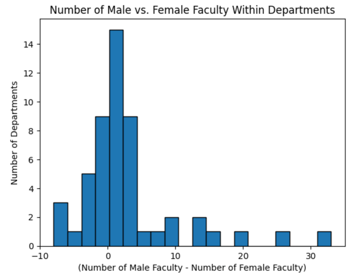 Figure 3: Bar graph reflecting the difference in number of faculty by gender, normalized
Finally, when considering the differences between lecturer ratings by gender, we wanted to consider the gender gap in Harvard academia. As can be seen in the graph above, many departments have significantly more male faculty than female faculty, suggesting that Harvard has work to do to close this gap.
Conclusion
The overall distribution of lecturer scores by gender indicates that there might exist a pattern in which female lecturers are given more extreme scores on both the higher and lower ends, differing from how male lecturers are scored. However, limitations prevent us from making a definitive conclusion regarding how implicit gender bias impacts lecturer ratings at Harvard. We do observe there exists a gender gap in most academic departments at Harvard, providing an opportunity for Harvard to improve its hiring practices.
Limitations
Our data set only uses QReports scores from Spring 2022. Therefore, it is difficult to conclude how implicit gender bias impacts lecturer scores at Harvard given a smaller sample size and no glaring patterns. Analyzing QReports lecturer scores over the past 10 years could give us a clearer picture of the effect of implicit gender bias on lecturer ratings.